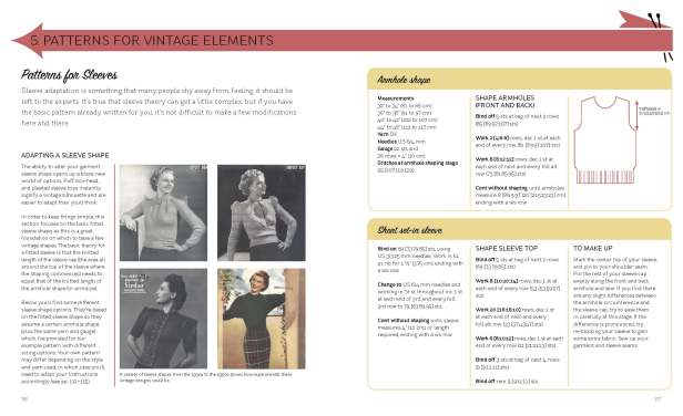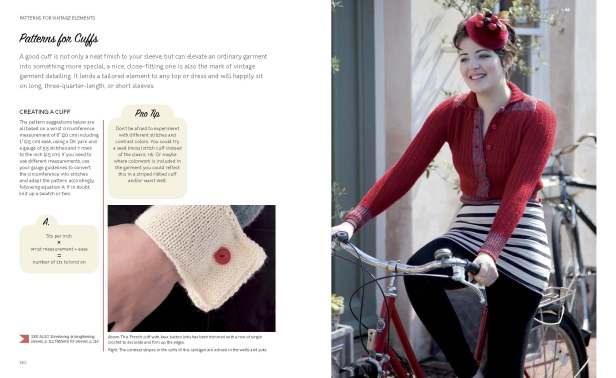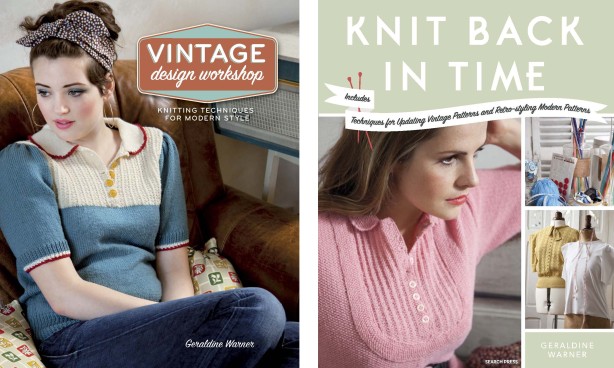
Here’s a title that I designed recently and is not yet published but is available for pre-order at Amazon for March 2013 (other on-line bookshops are available – please contact me if you’re one of them). Can’t wait to receive my copy of this! I’m showing both editions of this book – the one on the left is the US edition, the one on the right is the UK edition. As mentioned in my previous post, I design books for the international market. I work with a team at the packager/producer to produce a layout where the colour is produced as one layer (this used to be the colour film) and the text as a layer that can be replaced by the publisher if rights are purchased as a different language version.
This is my first review in my book review posts so I’m just shaping how it will work – if you have any suggestions as to what I should include then I’d be pleased to hear from you. Other books featured may be already published and I will say if they are already available for purchase.
Book Produced by: RotoVision
Published in the US by: Interweave
Published in the UK by: Search Press
See RotoVision’s catalogue page 17 for their entry on this title
My thoughts This title combines vintage, fashion and the practical application of how to make your knits have a vintage look plus how to modify actual vintage patterns to make them wearable today. Clear layout and referencing features make this easy to use, whilst the vintage pattern images are classic examples of why we love vintage fashion combined with modern photography of the knits as worn by contemporary women.
Working on this title An excellent editorial and design team at RotoVision made this a great experience. Written by the fabulous Geraldine Warner with super photography from Ivan Jones (I worked with him on Knitting with Balls for Ivy Press). The challenge on this title was how to make it accessible and practical but to look stylish and reflect the specific form of fashion featured. The mixture of actual vintage patterns and library images mixed with the modern photography and styling worked well together and saved it from looking like a pastiche which wasn’t the aim here. The original designs I did at presentation stage were adjusted to comply with the publisher’s requirements. NB. Covers were designed by RotoVision as is their policy.
Here is a selection of spreads from this title which give an idea of the style and content:


